Since the arrival of the new Mayor Paul Myers eight years ago, the appearance of Midsomer Norton has been considerably improved. The river flowing down the middle of the town was once full of rubbish and now has been cleaned. It meanders between beds of flowers and reeds. We now have a cinema facility located in our Town Hall which shows some of the latest films for the princely sum of five pounds without the need to travel.

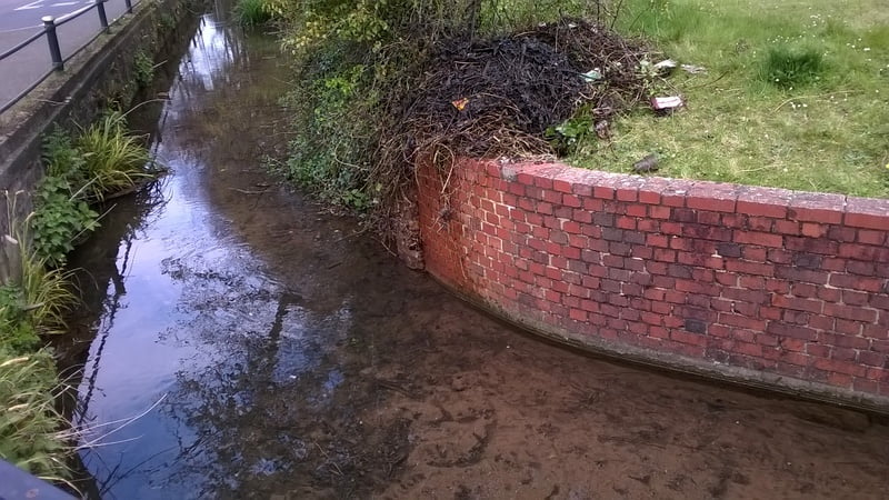
For some time I’ve been irritated by the presence of a large number of weeds in the said river Somer or should I say stream. Saturday was the day that I decided to do something about it. The job looks simple enough but what you don’t know is what lies underneath the surface of the water. If you don’t like the stink of decay, then don’t even think of doing this type of work.
Because I have to be careful about falling – my accident of two and a half years ago is fresh in my memory – I have to plan ahead and make sure that I do not stand a risk of falling. I therefore used a step ladder to get down into the water, a good pair of boots, and some equipment to grab the material and put it on the bank. Some of the material floated away downstream and that included bottles and tin cans. The whole procedure took about an hour. From the second picture, you will see that I have left the spoil on the site and not tidied it up. The reason is that it was largely water. I don’t intend to break my back carrying a lot of water so I shall let it dry and then go back later on and either burn it or take it away to the said recycle.
 On my second visit, I shall also trim the greenery right back to the tree that you can just about see about the pile of rubbish and then it should look nice. On the subject of safety, every day the population thinks that they can do something and get away with it without falling or having some sort of accident. It is a good idea to pause for thought before doing anything and say to yourself “what if”. Take extra precautions and you should be free of an accident though there is no guarantee.
*****
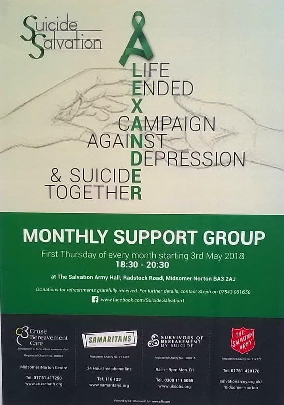
I was having coffee in my favourite cafe in the town when I saw this advertisement advertising social events for those who are depressed. The more I looked at it, the more I realise what a terrible poster it is.

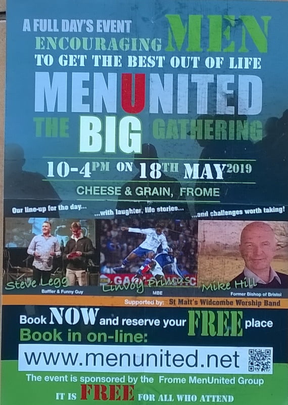
I could write a whole chapter on this one but does a person who feels suicidal want to admit it to everyone else by going along to a meeting. Is it a campaign against depression, would it be the topic of a rally or gathering, or is it a meeting for collective suicide. Where is the friendliness of the poster? I find it so impersonal and frankly unattractive. You have got two seconds of someone’s time if you are lucky in this doesn’t convey anything apart from the fact that there is a meeting from time to time. The same goes for the poster above. If you are acquainted with the back story you can see that it is an occasion for men to have an experience of Jesus Christ. If you are not party to this, it could be a fitness club, a personal motivation day, anything really. The typefaces at the top are confusing and difficult to read. I notice that in the top line “MEN” is written in the same typeface as used on the side of packing cases for something that is temporary. It says “book now and reserve your free place” but it doesn’t say you could turn up on the day. The bottom line is not even English. It is free for all who attend. And if you don’t attend? There is no number to enquire if you have a question. What a waste of paper.
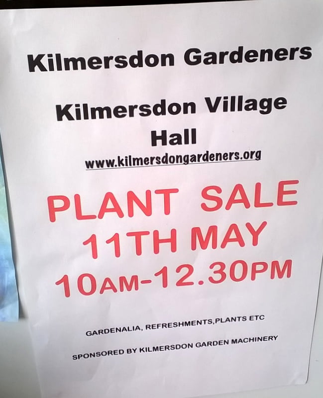
 This one does a far better job. It tells you what it is, when it is, the time window, where to go, what is available when you’re there.
The golden rule is when you design anything for any purpose you beta test it or if you prefer give it a test run. You as designer show it to someone who has no knowledge of the subject matter and ask them what they think about it. If 9/10 of them haven’t a clue what it’s about then you go back to the drawing board and start again. The point about the Men United example – and indeed the one at the top – is that it is written in terms of the mission statement of the organisers. It is not written from the point of view of possible needs of the client group. It does not answer the question “what’s in it for me”. In fact, it doesn’t answer any questions.
0 Comments